
Colour is more than just decoration, it is one of the most powerful assets to communicate your brand.
Generally 2-3 colours will be sufficient to represent your brand clearly. You want your audience to feel a certain way about your business, its services and products, and the industry that you are a part of.
Shades of colours are equally important, as darker shades give a brand a more mature and serious feel. Where as lighter shades evoke feelings of youthfulness and curiosity.

Featured Image by Plafondienst
Red
Red is a colour of strength in many cultures. It is bold, energetic, announces itself with urgency and inspires action. Red is a great choice for movements and activism. Use red when you want to call direct attention to your cause.

Featured Image by Beserk
Orange
Orange is the colour for creativity and enthusiasm. Children and adults alike respond to the approachable vibrancy of orange when used harmoniously.

Featured Image by ELLE
Yellow
Yellow grabs attention much like red, but can quickly become overwhelming if used too much. Its strengths lie in bringing warm and happy feelings to its viewers. Like orange, it is popular with children.

Featured Image by Citizen
Green
Green is the most calming colour. It represents that same feeling we are all familiar with when spending time in nature. Which makes it a go-to choice for environmentally friendly brands and wellness.

Featured Image by Architectural Digest
Blue
Blue is the most popular colour overall in our world. It holds feelings of trust and credibility, so many insurance and cleaning companies make it their primary brand colour.

Featured Image by unsplash
Purple
Purple is the adored colour of kings, the colour was expensive and difficult to acquire. Due to this fact it has long been associated with power and wealth. It is also representative of stability and strength, as blue and red make purple. It can also evoke feelings of peace in lighter shades and elegance in darker shades.

Featured Image by Mylands
Pink
Pink gives off playful, gentle and feminine energy. For many women-focused, beauty and fashion businesses pink is vital in their brand. In softer tones it becomes more nurturing, while hotter pinks are passionate and exciting.

Featured Image by unsplash
Brown
Brown is another colour that builds trust as its earthy tones give off the feeling of simplicity, security, ruggedness, honesty and dependableness. A well suited choice for trades companies, and any skilled profession that wants to focus on experience being part of their selling point. It is also a commonly used background colour in design, and conveys the outdoors.
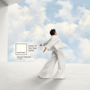
Featured Image by House Beautiful
White
White is the most widely used background colour in design, especially when readability is the core purpose of the design. When placed well it motivates viewers to come up with new ideas and promote feeling of clarity, when overused it can feel isolating and empty. In addition it is the choice of many health-related businesses as it is associated with health and hygiene.

Featured Image by unsplash
Grey
Grey is usually used to convey seriousness, wisdom, neutrality and authority. The downside is it can be perceived as unemotional and disconnected. Car manufacturers, jewellers and the biggest wiki online (Wikipedia), use grey.

Featured Image by C&D Fine Art
Black
Black represents many meanings. It covers both tradition and modernity, depending on the context. Black also is associated with elegance, boldness, luxury, maturity, strength, death and tragedy. It is a perfect background colour as it matches well with any other.
How to Choose Your Own Colour Personality
As we explored in the intro, choosing colours for your business is a matter of strategy rather than decoration. They are not an accident, but rather chosen from research.
1. Build your brand identity
We must consider what represents our brand, how your audience will perceive it, then how you want them to feel or act in response.
2. Read up on colour psychology
Too accurately find and mark your place in the eye and mind of the public, reading up on colour psychology is an absolute must.
A few main reasons being:
- To acquire an understanding of how colours of certain kinds can influence and give form to the moods, behaviour, attention spans and perceptions of the public.
- To know that while colours have the ability to influence how we think and feel. The effects are often subject to personal, cultural, and situational factors.
- To use colour psychology strategically in support of customer choices, focus, and performance.
3. See what your competitor’s colours are
Even if you choose the same colours as your competitors, it is only one aspect of your brand. One colour is generally affected by the other colours beside it and can be perceived rather differently.
Generally your choice of images affect most of how your brand is perceived. For example, a dusty motorcycle out on a dirt road feels very different to a polished motorcycle displayed in a well lit showroom.
In addition, when sourcing images focus on the keywords of how you want your brand to feel. Also, do not forget the power of your font choices and brand messaging.
4. Start with choosing the Primary Colours
The primary colours are the colours that need to best reflect your brand’s values and character. As it will always be used in your logo and marketing materials.
5. Choose accent colours
The accents colours complement your primary colour and trigger different emotions. Use these colours minimally, on all your call-to-action buttons or social media graphics. Two or three accent colours are recommended.
6. Test your colours
Test them in a few different settings to find out if your colours accurately convey your brand. Ask for opinions and make any necessary changes.
Where your Colours should be seen
Ensure your colours are displayed in a wide variety of different places. Including:
- Logo
- Social Media
- Website
- Staff Uniforms
- Instore
- Adverts
- Events
- Stationery
Disclaimer
Colour can vary by culture, what feels cheerful for one may have a completely different meaning elsewhere. For example, yellow represents happiness, warmth and optimism in countries like America and Australia. Yet in Egypt it represents death and mourning, or jealousy and envy in Germany.
References
Choose Colors Like a Pro: A Graphic Designer’s Strategic Guide ~ Razor Web Design
10 Color Personalities + How To Choose Yours ~ Mistudio.Co
Color Personalities and How to Choose Yours ~ BackSlash Creative
The Psychology Behind Your Logo Colors ~ Creato
How Colour Psychology Affects Moods, Feelings, and Behaviours ~ VeryWellMind
What if your competitors have the same colour scheme as you? ~ TractorGirl
Resources
The Psychology of Color in Design ~ Lindsay Marsh
How To Use Color Psychology In Marketing And Branding (Choose Your Brand Colors) ~ Brand Master Academy
Leave a Reply